The Transformative Impact Of Color In Home Design
Introduction to Color Psychology
Color goes beyond merely a visual aspect in home design; it is a potent resource for altering environments and shaping feelings. Whether embarking on a personal project or enlisting the help of professional painters, understanding color psychology can lead to intentional and impactful choices. Colors evoke emotions, affect mood, and alter perceptions, making them vital in creating the desired ambiance in any room.
For years, experts have studied how different colors affect psychological responses. Red can evoke passion and energy, while blue often brings tranquillity. Yellow is usually associated with warmth and joy. By understanding these associations, homeowners can select colors that express their style and create environments that promote well-being and satisfaction.
How Colors Affect Mood and Perception
Colors are inherently linked to human emotions, and their presence in a room can dramatically sway one’s mood. For instance, the calm serenity of blues and greens makes them ideal spaces for relaxation and peace, such as bedrooms or spa bathrooms. Meanwhile, warmer tones, like reds and oranges, inject energy and vigor, perfect for social spaces like living rooms and dining areas.
According to research on the psychological effects of color, neutral colors such as grays and whites provide a balanced backdrop that allows for introducing bolder elements elsewhere. These colors can open up a space, making it feel more extensive and more inviting. By carefully selecting a balanced mix of colors, you can craft spaces that meet aesthetic and functional needs, enhancing overall quality of life.
Choosing the Right Palette for Different Rooms
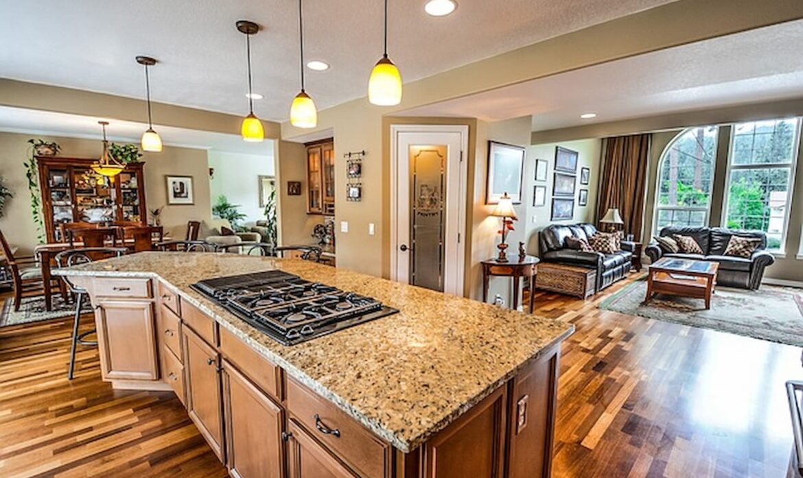
When diving into color selection, it’s essential to consider the function of each rooms. Kitchens, often the heart of the home, become more welcoming with warm hues that stimulate conversation and appetite. On the other hand, bedrooms benefit from cooler tones that promote restfulness and sleep. Utilizing the right palette beautifies a room and supports its intended use.
Achieving harmony in a home often involves creating a flow from one room to another. This cohesion can be achieved by selecting a primary color to anchor the design and incorporating complementary or contrasting hues as accents.
The Role of Light and Space in Color Selection
Light greatly influences how colors are perceived in a space. Natural light can reveal the undertones of color, making it appear lighter and more vibrant during the day. In contrast, artificial light can alter these hues, necessitating thoughtful planning in color selection. Understanding how light affects color can prevent mismatched expectations once the paint is applied.
Additionally, the size and shape of a room play critical roles in color perception. Darker colors can make a large room feel intimate and cozy, while they might overwhelm a smaller space, making it suffocating. Harnessing insights from an interior design expert can guide homeowners in effectively pairing light with color to achieve the desired visual impact.
Incorporating Trends in Color Use
Color trends are continuously evolving, offering fresh inspiration for home design. Many designers currently embrace earthy tones, which provide a connection to nature and invoke a sense of calmness. Bright jewel colors are also resurgent, adding dramatic yet sophisticated vibes to living spaces.
While it’s tempting to dive headfirst into trends, balancing fashionable and timeless designs is vital. Accessories, like throw pillows, artwork, or accent walls, can incorporate trendy colors without a complete overhaul, keeping the overall decor flexible and adaptable to future trends and personal preferences.
Practical Tips for Color Application
Transforming a room with color goes beyond selecting hues; the application is key to achieving a flawless finish. Preparing surfaces by cleaning and priming them ensures paint adheres evenly. Selecting high-quality brushes and rollers is also critical in achieving a smooth application.
Practicing techniques such as “cutting in” or painting edges before covering larger areas can significantly improve the outcome. Approaching a painting project with patience and precision ensures the chosen colors are presented in their best light, enhancing the space’s aesthetic appeal.
Real-Life Case Studies
One can look to real-life examples to truly grasp the transformative power of color. Consider a living room initially defined by dull, beige walls. The space is redefined by adding a bold teal accent and crisp white trim, brimming with energy and a welcoming atmosphere. Such transformations highlight color’s significant impact on altering perception and mood.
Before-and-after comparisons of these projects demonstrate that thoughtful color applications can breathe new life into a space, reflecting personality and style while improving the ambiance.
Conclusion: The Lasting Effect of Color
When thoughtfully applied, color is an essential component in any home design project. It influences not only the aesthetic but also the emotional responses of those who inhabit the space. By considering psychology, light, and function, homeowners can harness the power of color for their benefit.
Embracing the opportunity to add personal flair through color selection allows individuals to create unique, inspiring environments that resonate profoundly with their occupants, proving that color’s effect extends far beyond the surface.